Interactive Infographics: A Picture of the Premise, Tools, & Process

By jfuchs@hubspot.com (Jay Fuchs)
The infographic is one of the most effective mediums content marketers have at their disposal. It’s a format that allows you to create content that’s compelling and compulsively shareable without sacrificing utility and thoughtfulness.
But there are some cases where normal infographics just don’t cut it. So what can you do to elevate them? Is there a way to make them that much more gripping and intriguing? If you’re asking yourself those questions, you might want to consider making your infographics interactive.
Here, we’ll go over what an interactive infographic is, learn what it takes to make one, see some examples, and review some of the programs you can use to make one of your own.
In many respects, interactive infographics are a big part of the future of informational content. According to research by DemandGen, 85% of B2B marketers are already using or plan to use interactive infographics as part of their strategy.
But why is that the case? Why are companies so interested in incorporating these kinds of infographics into their content marketing strategies? Well, simply put, interactive infographics are more compelling than static ones.
They add a more immersive element to the medium and, in turn, drive greater engagement. Interactive content can also help express and promote a brand voice and identity. A study by the Content Marketing Institute found that 75% of marketers agree that non-gated interactive content can provide a “sample” of the brand, resulting in a higher degree of lead nurturing.
Ultimately, you can rope readers in by letting them directly interact with your data, they’ll be more inclined to learn and retain the information you’re sharing. That often translates to sincere interest in your business as a whole.
How to Make an Interactive Infographic
1. Gather and compellingly convey your data.
The first step to creating an interactive infographic — along with virtually any kind of informative content — is gathering data. An interactive infographic without interesting data is more or less a pretty picture with some information.
Once you have your data on hand, try to find a way to convey it with some oomph. A dry infographic isn’t going to drum up the kind of enthusiasm or engagement you’re looking for. See if you can tell a story with your information. Be intentional and interesting with the language you use.
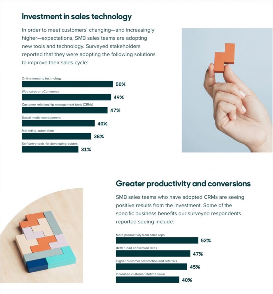
Take a look at this example:
Whoever made this graphic managed to incorporate hooks, powerful language, and a cohesive theme to articulate their data and what it entails — making it more compelling, engaging, and readable than it would’ve been if they just threw out a laundry list of hard statistics.
2. Organize your data with compelling visual elements.
The operative term in the phrase “infographic” is “graphic”. Visual elements separate this kind of content from bland lists of facts or statistics. When making an interactive infographic, you need to incorporate interesting visuals to …read more
Source:: HubSpot Blog