17 of the Best Examples of Beautiful Blog Design

By lkolowich@hubspot.com (Lindsay Kolowich Cox)
According to a recent survey, blogs have ranked as the third most trustworthy source of information, following only friends and family. That’s right — bloggers are trusted more than celebrities, journalists, brands, and politicians.
But how do you get people to fall in love with your blog in the first place? (Aside from remarkable content, of course.)
Well, just as your website homepage is like the front door to your business, your blog’s design — much like a welcome mat — is the front door to your business blog.
If you’re not attracting people visually, how will you get them to take the next steps to actually read (and, hopefully, subscribe to) your content?Once you’re done creating the quality content, you still have the challenge of presenting it in a way that clearly dictates what your blog is about. Images, text, and links need to be shown off just right — otherwise, readers might abandon your content, if it’s not showcased in a way that’s appealing, easy to follow, and generates more interest.
That’s why we’ve compiled some examples of blog homepages to get you on the right track to designing the perfect blog for your readers. Check ’em out, below.
17 Inspiring Examples of Beautiful Blog Homepage Design
1. Help Scout
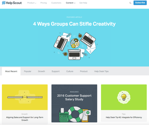
Sometimes, the best blog designs are also the simplest. Help Scout, makers of customer service software, uses a unique but minimalist design on its blog that we love — it limits the use of copy and visuals and embraces negative space.
What we particularly like about this blog is its use of featured images for all posts, including a banner one at the top that highlights a recent or particularly popular entry. These icons are set in front of bright, block colors that catch the readers’ eye and signal what the post is about. And it works — everything about this blog’s design says “clean” and “readable.”
2. Microsoft Stories
Full disclosure: We’ve totally gushed over Microsoft’s “Stories” microsite before. We can’t help it — what better way to revitalize an old-school brand than with a blog that boasts beautiful, interactive, and inspiring branded content? Plus, the square layout of these stories is reminiscent of the Microsoft logo, which achieves a valuable brand consistency.
Microsoft Stories is also a prime example of how a business blog can be a major asset for an overall rebrand. In recent years, Microsoft has worked to humanize its brand, largely in response to a rivalry with Apple. The “Stories” microsite has a simple tagline — “Get an inside look at the people, places and ideas that move us.” It’s the softer side of Microsoft, so to speak.
When you’re trying to convey a certain brand message, your blog can be used to communicate it — both aesthetically, and content-wise.
<img class="alignCenter shadow" src="https://blog.hubspot.com/hs-fs/hubfs/00-Blog_Thinkstock_Images/Microsoft_Stories_Blog.png?width=600&name=Microsoft_Stories_Blog.png" width="600" alt="beautiful …read more
Source:: HubSpot Blog


