The Ultimate Guide to Google Data Studio in 2020

By afrost@hubspot.com (Aja Frost)
Having the ability to visualize data helps you unlock invaluable insights for better decision-making in your business and gives you a serious advantage when it comes to getting competitive opportunities.
While many tools can help you visualize data, none compare to Google Data Studio, which is entirely free and accessible to all (even if you don’t have any data of your own!). Like most Google tools, Data Studio can be hard to master, but it’s well worth it. Once you’ve gotten comfortable with its features, you can use it to create stunning and informative reports for your clients, coworkers, or leadership team.
This guide will walk you through the most useful Data Studio tools. We’ll start with the basics before moving into the intermediate features. Finally, we’ll go over the advanced options.
1. Log into Data Studio
To log in to Data Studio, you’ll need a Google account — I recommend using the same one as your Analytics, Search Console, and/or Google Ads account.
You’ll land on the Data Studio overview page. Click the “Home” tab to view your dashboard.
2. Explore the Data Studio Dashboard
If you’ve used Google Docs, Sheets, or Drive before, this dashboard should look pretty familiar.
Reports
Here’s where you can access all of your reports (equivalent to a workbook in Tableau or Excel).
Notice that you can filter by who owns the report:

Data Sources
Data sources list all the connections you’ve created between Data Studio and your original data sources.
Data Studio currently supports 500+ data sources. Below are the most popular sources:
If you’re using Google Analytics and/or Search Console (which I highly recommend), you’ll need to individually connect each view and property, respectively.
So if you have three GA views for three different subdomains, you’ll need to set up three separate data sources.
Explorer
Explorer is an experimental tool that lets you experiment or tweak a chart without modifying your report itself.
For instance, let’s say you’ve created a table in Data Studio that shows the top landing pages by conversion rate. While looking at this table, you think, “Huh, I wonder what I’d find if I added average page load time.”
You don’t want to edit the chart in the report, so you export it into Labs — where you can tweak it to your heart’s content. If you decide the new chart is valuable, it’s easy to export it back into the report. (Jump to the section where I explain how.)
Report Gallery
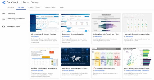
The report gallery is a collection of templates and examples you can use depending on your business needs.

For instance, if you run an ecommerce store, the ecommerce revenue template would be very useful.
Connect to Data
And here’s where you add data sources. (You can also add …read more
Source:: HubSpot Blog

![→ Download Now: SEO Starter Pack [Free Kit]](https://no-cache.hubspot.com/cta/default/53/1d7211ac-7b1b-4405-b940-54b8acedb26e.png)


