The 22 Best Conference Website Designs You'll Want to Copy


A conference website is a powerful way to generate buzz about your event, answer commonly asked questions, and boost ticket sales and attendance.
Since 2020, the majority of events have been hosted virtually — and this trend will likely continue in 2022 and beyond. In fact, the global virtual events industry is expected to grow 23.7% each year from 2021 to 2028, according to data from Grand View Research.
In an increasingly digital-first world, a conference website is more important than ever. As many people’s first introduction to your event, it can influence whether someone buys a ticket, or abandons the page entirely.
Below we’re going to explore over 20 of the coolest conference websites we’ve found. You can use these examples as inspiration when designing your own site.
Conference Website Design Best Practices
Before we dive into the examples we’ve collected, let’s explore some best practices to keep in mind when designing your own conference website.
A good conference website design should follow these best practices:
- Put your location and date above-the-fold: People should know immediately where, and when, your event is taking place. If they can’t find it easily, they could abandon your website. Before you dive into speakers or any other information, ensure your visitors know whether they can attend in the first place.
- Use interactive elements: Videos or animated graphics can go a long way towards making your website look sleek and professional. Plus, video is a good opportunity to showcase highlight reels from past events.
- Center the page around your visitor: What’s in it for them? Great speakers to inspire their work? A chance to network with industry leaders? Ensure your copy outlines — clearly and concisely — how your website visitor will benefit from your event.
- Have a clear call-to-action: Your page is ultimately meant to convert web visitors into event attendees — so make this easy to do. Create a bold “Register Here” or “Buy Tickets” button so your visitors can easily convert when they’re ready.
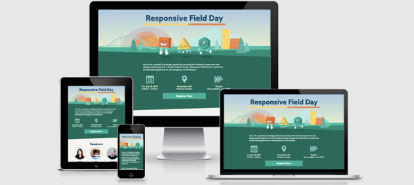
- Include fun visuals: One thing that’s apparent in all the conference web designs we chose is interesting, unique, fun visuals. Too much white space will likely bore visitors and not pique their interest enough to purchase a ticket. Use visuals to grab your visitor’s attention, and communicate through images what your event is all about.
- Create time-pressure by including a countdown feature: In a few of the websites we’ll look at below, you’ll see a countdown that outlines how many days, hours, or minutes visitors have left to sign up for the event. This is a fantastic way to create a sense of urgency and encourage visitors to sign up immediately — or risk missing out.
- Align with your brand identity: A conference is a great way to generate brand awareness to a much larger audience. With that goal in mind, you want to make sure your conference website aligns with …read more
Source:: HubSpot Blog


Author: Aaron