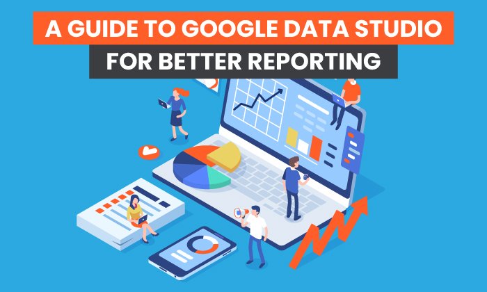
How to Use Data Visualization in Your Content to Increase Readers and Leads

By Neil Patel
Have you heard of data visualization? Even if you don’t know the term, you’ve probably seen some examples.
Data visualization refers to graphical images that represent and explain data trends or other numerical information, such as charts, maps, scatter plots, or graphs.
You can use data visualization in articles or on web pages to make numbers and data easily digestible to the reader. Especially when you are trying to distill down complex topics to convert more readers, data can add value and help you make your case.
The Benefits of Data Visualization
Visuals are a powerful addition to your articles and presentations.
Our brains process images at a rapid pace, according to an MIT study. Including visuals in your article not only breaks up the text and gives your reader something else to look at, but also may help them process the information more quickly.
Think about it: we’ve been communicating visually from the cave painting days. Data visualization just takes image communication to the next level, integrating stats and data into compelling visuals that your brain can absorb faster than just scanning numbers.
Plus, it’s more than just laying out the numbers. Data visualization is about presenting data in a very specific way to back up your claims or illustrate your point. It’s more than just a table of statistics the reader has to work through to figure out for themselves.
Numbers can often be the “proof” you need to convince your reader to take the next step or to make a purchase, but many people don’t want to take the time to read through all the data.
According to the Nielsen Norman Group, people don’t read word-for-word online, going back to the internet’s earliest days. Instead, they scan, looking for stand-out headlines and images that grab them. Data visualization gives you that opportunity to capture their interest and get important stats in front of their eyes.
Examples of Data Visualization
Are you inspired to start creating data visualization images for your content, or are you still needing some examples? Here are a few ideas to get you thinking.
1. USA Today Housing Bubble Graphic
Using an interactive map, USA Today created this graphic to help readers understand the data behind current housing sales trends. The simple color palette makes it visually appealing, and the ability to scroll over each state to learn more means readers may spend more time on the page, interacting with the data.

2. CNBC Job Change Graph
This visual from CNBC is an example of using a bar graph in a visually compelling way. At a quick glance, you can see what’s growing and decreasing. As you look closer, you can check out more detail about the numbers and …read more
Source:: Kiss Metrics Blog