How to Use the Rule of Thirds in Web Design [Quick Tip]



To understand the “rule of thirds” as it relates to web design, let’s start with an example.
Consider this image of a bull in a field:
Not too interesting, right? As the center of the image, the bull image feels a little bland and predictable. I’m willing to bet if you saw this image on a website, you wouldn’t dwell on it too long.
Now, consider what changes when we use the rule of thirds to place the bull away from the center:
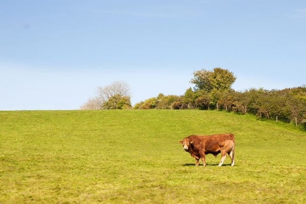
A little more interesting, right?
The rule of thirds can help make your designs feel less predictable and more intriguing. And, ultimately, it has the power to capture the viewer’s attention for longer — which is critical when you’re trying to capture new audiences and convert those audiences into leads for your brand.
Of course, there are exceptions to every rule. Perhaps you’ll decide your designs are more compelling when they’re symmetrical. Still, you can only make the intentional decision for your own website after you’ve explored your options.
Here, we’ll learn how to use the rule of thirds in design and UI design to take your images to the next level.
How to Use the Rule of Thirds in Design
Simply put, the rule of thirds posits that designs are more interesting and visually appealing when you place the main object(s) of your design on one of the four intersections of a rule of thirds grid, or in one of the thirds sections.
It’s no secret that art is more than just guesswork. Dating back to Ancient Roman times, geometry has always had a place in significant artwork.
To understand the rule of thirds, let’s look at an example.
The rule of thirds draws two lines perpendicular to a page, and two lines horizontal to a page, to create a grid of nine boxes.
This divides your page into three one-third sections, regardless of whether you’re slicing the image horizontally or vertically:
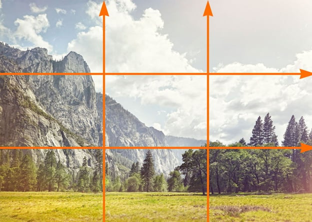
Next, to use the rule of thirds in design, you’ll simply want to place your object(s) off-center by putting them into one of the thirds sections:
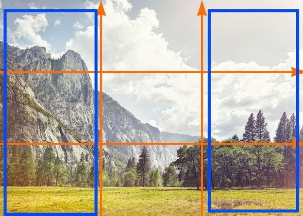
… Or on one of the intersecting points:
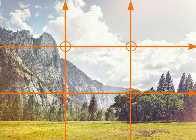
In the example shown above, the main focal point — the mountain top — is off to the left-side of the center of the image, in the first-third of the photo.
Fortunately, it’s easy enough to use the rule of thirds in your own images using a design tool like Photoshop, which offers a grid feature so you can ensure you’re accurately using the rule of thirds to create a …read more
Source:: HubSpot Blog