Best Data Visualization Tools

By Neil Patel
Disclosure: This content is reader-supported, which means if you click on some of our links that we may earn a commission.
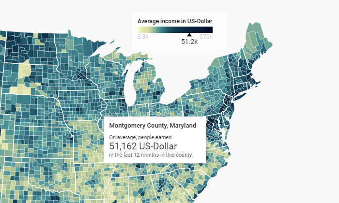
The right image convinces a conference room instantly.
Sell that new client, get your boss’s approval, and rally the team behind you. Data visualization tools turn a whole mess of numbers into a crisp image that says it all.
With the right product, you can take command of overwhelming amounts of data to tell a clear and compelling story, while leaving your audience with a visual that resonates long after your presentation concludes.
In this post, I’ll give a complete overview of the best data visualization tools, and what to look for as you make your decision.
The Top 5 Options for Data Visualization
- Tableau – Best for Enterprise
- Infogram – Best For Collaboration
- Plecto – Best for Sales Teams
- Datawrapper – Best DIY Visualization Tool
- Highcharts – Best for Interactive Visualizations
How to Choose the Best Data Visualization Tool for You
I get it. There are a million tools to help you visualize your data.
Then, when you start digging, it’s like, “Wait, do I have to know several programming languages to use this really cool product?”
Slow down. Don’t worry. You’re not going to have to go back to school to get amazing data visualizations.
Some of the high-end tools will require a little IT know-how to get off the ground, but those are really aimed at companies who can factor that into their budgets.
If that’s not what you’re looking for, no worries. There are really great data visualization tools a non-specialist can have up and running before lunch.
The key is knowing what you want your data visualization tool to do.
By understanding your local requirements, you can whittle down your options quickly by going through each of the major elements of data visualization products.
Visualization Capabilities
Are you looking for a nice tool that creates sleek reports, or a platform that lets you publish interactive dashboards?
Every vendor showcases data visualization examples on their site. Check these over and really reflect on your gut reaction.
If you are in search of the “wow” factor, don’t settle until you find something that will give your presentations that aesthetic edge.
Connectivity
This is perhaps the biggest make-it-or-break-it factor on the list: What data types and sources are supported by the data visualization tool?
No data visualization tool is good enough to justify a massive migration. You need to find something that connects with your data, wherever it lives.
Ideally, connecting data is an easy, secure, and highly-visible process.
Look for products that clearly explain how to manage and connect data sources. Official partnerships with the database products you use is a big plus.
Cruise a few reviews to see if people are finding that the connectivity is as good as advertised. Also, be sure to walk your sales team through your desired deployment to make sure it’s going to work as planned.
Skill Requirements
Not so long ago, complex data visualization required familiarity with structured query language (SQL), Python, …read more
Source:: Kiss Metrics Blog


