A Non-Designer's Guide to Visual Hierarchy [Best Practices + Examples]

By mbretous@hubspot.com (Martina Bretous)
Ever click on a website, take one look and say “Hm, that’s going to be a no” while you look for the exit button?
For me, it’s usually because of three reasons: the site looks outdated, crowded, or hard to navigate.
Bad design can keep your target audience from gaining any interest in your brand.
That’s why it’s important to understand the key design principles that will help you draw your audience in, keep them on the page, and generate conversions.
Here’s an easy guide on a specific design principle: visual hierarchy. We’ll cover all the elements that contribute to visual hierarchy and look at good and bad examples.
Visual hierarchy affects what you look at and focus on in a design, whether it’s an image, graphic design, or web design. It’s a key player in ct (i.e., how information is organized and displayed for easy understanding and navigation) and can greatly impact the user experience (UX).
When thinking about visual hierarchy, you want to ask yourself a few questions:
- What do we want to draw attention to?
- What actions do we want our users to take?
- Where does the eye naturally go to and where do they land?
Asking these questions will help you use the principles outlined below to create a clear visual hierarchy.
What constitutes bad visual hierarchy?
When it comes to visual hierarchy, there’s a golden rule: If every element appears important, nothing will seem important.
Visual hierarchy serves as a way to rank the information you’re consuming. If there is no way to differentiate between the elements, that is considered poor hierarchy.
Take this example:
On the left, there’s a lot much going on. The two main elements are the same size, there are many different colors. It makes it hard to know where to look. Your eyes glaze over everything, creating some uneasiness and lack of direction.
On the right, your eye is automatically drawn to the main blue box on the left, then naturally goes to the elements on the right before landing on the orange call to action (CTA).
A poor visual hierarchy:
- Confuses the user.
- Makes it unclear where to look.
- Creates a bland design.
Instead, create a visual structure that facilitates understanding and guides the user.
1. Consider reading patterns.
When designing, you want to note your target audience’s natural eye patterns.
Across all cultures, we read top to bottom. However, there is some variation in how we read horizontally. Western cultures tend to read from left to right, while some Semitic and Indo-Aryan languages, such as Arabic, Hebrew, and Urdu are read right to left.
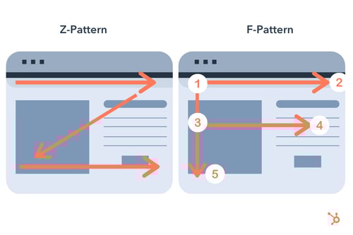
With this in mind, it impacts how we scan and understand designs. For instance, Western users usually follow an F or Z reading pattern.

Knowing this information will help you design …read more
Source:: HubSpot Blog


