16 Web Design Trends to Watch in 2021

By kcook@hubspot.com (Karla Cook)
The landscape of web design is always evolving.
Something that looked modern and fresh yesterday can appear dated seemingly overnight, and trends once dismissed as irrevocably passé can unexpectedly cycle back in vogue.
Still, one thing remains constant: Websites are the most important marketing channel for many businesses, and the second most popular marketing channel among businesses according to HubSpot research.
Given the importance of websites to most businesses and the fact that half of consumers think website design is crucial to a business’s brand, it’s worth the effort to make your own website that matches today’s trends.
However, this doesn’t mean you need to scrap your site’s vision to engage visitors. There’s plenty of room for stylistic choices across the spectrum. As HubSpot Senior Product Designer Dan Hartshorn notes, “I’ve noticed lately many SaaS offerings go either monochromatic or black&white in their UI, or go the opposite direction, and just COVER their UI in color, shadows, gradients, skeuomorphic, etc.”
To help you prepare for wherever the web design tide takes us, we’ve put together a list of 16 trends to keep a close eye on. Check them out below, and get inspired to tackle your web design projects this year with style.
1. Bold Typography
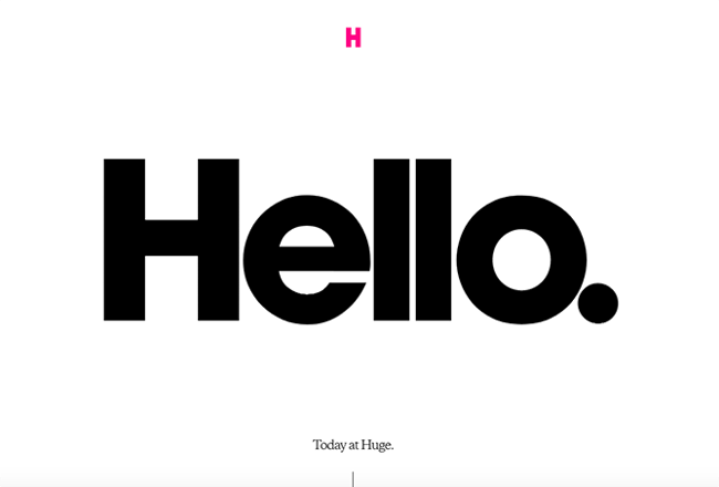
More and more companies are turning to big, bold typography to anchor their homepages. This style works best when the rest of the page is kept minimal and clean, like this example from Brooklyn-based agency Huge.

2. Cinemagraphs
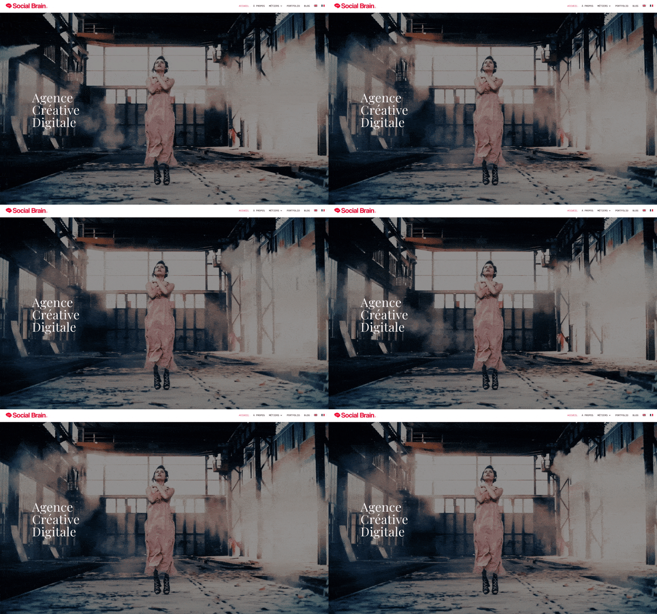
Cinemagraphs — high-quality videos or GIFs that run on a smooth, continuous loop — have become a popular way to add movement and visual interest to otherwise static pages. Full-screen loops, like this example from French creative agency Social Brain, create immediate interest on an otherwise simple page.

3. Brutalism
To stand out in a sea of tidy, organized websites, some designers are opting for more eclectic, convention-defying structures. While it can seem jarring at first, many popular brands are now incorporating these aggressively alternative design elements into their sites, such as Bloomberg.
Brutalism emerged as a reaction to the increasing standardization of web design and is often characterized by stark, asymmetrical, nonconformist visuals, and a distinct lack of hierarchy and order. In other words, it’s hard to describe but you know it when you see it — like with the below example from Chrissie Abbott.
-1.jpeg?width=650&name=Update%20website%20design%20trends%20(heavy)-1.jpeg)
4. Saturated Gradients
Gradients have been all over the web for the past few years, and it doesn’t seem like they’re going anywhere just yet. Copywriting agency …read more
Source:: HubSpot Blog


