Color Theory 101: A Complete Guide to Color Wheels & Color Schemes
By bcartwright@hubspot.com (Bethany Cartwright)

2. Analogous
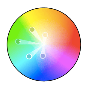
Analogous color schemes are formed by pairing one main color with the two colors directly next to it on the color wheel. You can also add two additional colors (which are found next to the two outside colors) if you want to use a five-color scheme instead of just three colors.

Analogous structures do not create themes with high contrasting colors, so they’re typically used to create a softer, less contrasting design. For example, you could use an analogous structure to create a color scheme with autumn or spring colors.
This color scheme is great for creating warmer (red, oranges, and yellows) or cooler (purples, blues, and greens) color palettes like the one below.

Analogous schemes are often used to design images rather than infographics or bar charts as all of the elements blend together nicely.
3. Complementary
You may have guessed it, but a complementary color scheme is based on the use of two colors directly across from each other on the color wheel and relevant tints of those colors.
When you’re sifting through your News Feed, what tends to catch your attention? More likely than not, it’s YouTube videos, pictures, animated GIFs, and other visual content, right?
While text-based content is always important when seeking answers to a question, creating visuals such as infographics, charts, graphs, animated GIFs, and other shareable images can do wonders for catching your readers’ attention and enhancing your article or report.
I know what you might be thinking: “I don’t know how to design awesome visuals. I’m not creative.”
Hi. I’m Bethany, and I will be the first to tell you that I’m not naturally artistic. And yet, I found a strength in data visualization at HubSpot, where I’ve spent most of my days creating infographics and other visuals for blog posts.
So, while I wouldn’t say I’m naturally artistic, I have learned how to create compelling visual content. So can you.
And you can do this by learning color theory. Consider this your introductory course, and we’ll be covering the following topics:
- What Is Color Theory?
- Why Is Color Theory Important in Web Design?
- Color Theory 101
- Additive & Subtractive Color Theory
- The Meaning of Color
- The Seven Color Schemes
- How to Choose a Color Scheme
- Color Tools
What is color theory?
Color theory is the basis for the primary rules and guidelines that surround color and its use in creating aesthetically pleasing visuals. By understanding color theory basics, you can begin to parse the logical structure of color for yourself to create and use color palettes more strategically. The result means evoking a particular emotion, vibe, or aesthetic.
While there are many tools out there to help even the most inartistic of us to create compelling visuals, graphic design tasks require a little more background knowledge on design principles.
Take selecting the right color combination, for instance. It’s something that might seem easy at first but when you’re staring down a color wheel, you’re going to wish you had some information on what you’re looking at. Understanding how colors work together, the impact they can have on mood and emotion, and how they change the look and feel of your website is critical to help you stand out from the crowd — for the right reasons.
From effective CTAs to sales conversions and marketing efforts, the right color choice can highlight specific sections of your website, make it easier for users to navigate, or give them a sense of familiarity from the first moment they click through.
But it’s not enough to simply select colors and hope for the best — from color theory to moods and schemes, finding the right HTML color codes, and identifying web-accessible colors for products and websites, the more you know about using color, the better your chances are for success.
Read on for our designer’s guide to color theory, …read more
Source:: HubSpot Blog


