What is the 7×7 Rule in PowerPoint?

Despite its reputation for dry content delivery across virtual and in-person meetings alike, PowerPoint remains the go-to choice for many professionals, even as other options emerge that offer greater usability and flexibility outside of the Microsoft ecosystem.
Part of the presentation platform’s popularity stems from its familiarity — many organizations still run Microsoft-first IT software environments, making PowerPoint the obvious choice for straightforward presentation design. Simplicity provides the second part of this popularity permutation since creating a basic PowerPoint presentation on a single topic requires minimal time and effort.
The problem? “Simple” doesn’t always mean “effective”. Staff across markets, industries, and verticals worldwide have stories about unbearably long and boring PowerPoint presentations that were long on details but short on value. The 7×7 rule offers a framework to help boost PowerPoint form and function by reducing text volume and improving information impact.
In this piece, we’ll break down the 7×7 rule in PowerPoint, best practices, and offer some actionable examples of seven-by-seven solutions in-situ.
The PowerPoint Problem
To put it simply, most viewers don’t like PowerPoint. While the format has the benefit of speed and convenience — and can conceivably be used to communicate information quickly and concisely — many presentations are overlong and overwrought with bonanzas of bullet points that seem relevant but are really just digital hot air.
In most cases, the disconnect between appearance and action is boring at best and irritating at worst. As noted by the BBC, however, in extreme cases — such as NASA’s Challenger shuttle disaster — overlooked information in an overstuffed presentation can have significant real-world consequences.
Best bet? To avoid PowerPoint frustration and fatigue, it’s time for a new framework: The 7×7 rule.
What is the 7×7 rule in PowerPoint?
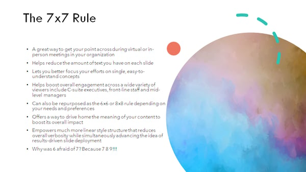
The 7×7 rule is simple: For every slide, use no more than seven lines of text — or seven bullet points — and no more than seven words per line. Slide titles aren’t included in the count.
There’s no specific data supporting the 7×7 model as the ideal; some PointPower proselytizers consider 8×8 good enough while others say 6×6 is more streamlined. The point here isn’t the hard-and-fast number but the underlying idea: Cut out extraneous information to improve presentation uptake.
Slides can still contain images — and should, wherever possible — but sticking to the 7×7 rule helps cut down on excess data that might be better-shared in follow-up emails or one-on-one discussions. In effect, the 7×7 rule is a way to reduce the amount of time staff spend pretending to care about PowerPoints and instead help them focus on slide information that’s relevant, contextual, and actionable.
Best Practices for the 7×7 Rule in PowerPoint
Building a typical PowerPoint slide is straightforward. Like any business practice, however, it can be improved with a standardized set of rules designed to limit waste and improve efficiency. And when it comes to most PowerPoint presentations, almost any change makes a positive impact.
Let’s …read more
Source:: HubSpot Blog


