Mobile Conversion Rate: What It Is and How To Increase It

By lhintz@hubspot.com (Lauren Hintz)
Is your website ready to attract and convert mobile website visitors into leads?
According to Adobe, companies with mobile-optimized sites triple their chances of increasing mobile conversation rate to 5% or above.
If that’s not enough to sell you on the importance of delivering a mobile-optimized experience, Google recently announced that more Google searches take place on mobile devices than on computers in 10 different countries including the United States and Japan.
All this talk of mobile got me thinking about how website visitors were accessing our offers. And after a closer look, I discovered that conversion rates on our landing pages were 20-30% lower from visitors coming from mobile. (As a lead generation geek, you can imagine how psyched I was to uncover such a huge opportunity for gathering more leads.)
With this information in tow, I set out to solve this problem — and I think you’ll be intrigued by what I found.
The Methodology
The hypothesis of this experiment was that by making content more easily digestible on mobile devices, it would increase conversion rate. However, getting inside the heads of our mobile visitors took a bit of reflection. I had to ask myself, “What would cause someone to bounce?”
Some answers I came up with were:
- The form is too long.
- There is too much text on the landing page to read.
- The design isn’t formatted for a mobile phone.
When presented with information that is not super mobile-friendly, a visitor won’t hesitate to bounce from your landing page.
Why?
Not only are poorly formatted pages time-consuming, but they also don’t appear very reputable, which often causes visitors to lose trust. With that decided, we knew we needed a way to condense all the information on the landing page to fit the size of a mobile screen.
The Experiment
To give you a better idea of what we were working with, check out what our landing pages looked like initially:
As you can see, it was quite long with a lot of content. So in order to improve the user experience on these landing pages, we leveraged smart content to shorten the display for mobile users. (To learn more about how smart content works, check out this resource.)
The first step we took was shortening the content and formatting the images for mobile:
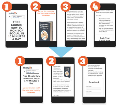
Once that was completed, we tackled the form:
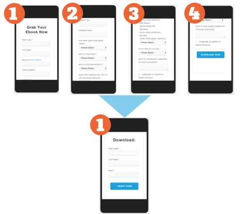
Voilà! With the help of smart content, mobile visitors are now shown a shorter, more digestible form.
The Analysis
With the changes in place, we decided that measuring the page’s bounce rate would help us determine if the mobile smart forms helped improve our conversion rates. Essentially, bounce rate refers to the percentage of people who …read more
Source:: HubSpot Blog

