14 Real-Life Examples of CTA Copy YOU Should Copy

By jrumberger@hubspot.com (Jana Rumberger)
Moving people to act is a challenging task. With just a few words, CTA copy needs to show that you see where your audience is coming from and empathize with their issues. That CTA (call-to-action) must also motivate them to move toward a solution.
If the CTA copy you craft doesn’t keep your visitors’ attention, it can hurt your click-through rate, lead conversions, and ultimately, sales.
So, a CTA needs to inspire, encourage, and coax a person into action, but not bore, scold, or distract. Clearly, writing CTAs is a tricky balance of skill, influence, and awareness. But how can you write the perfect CTA copy on your own?
Keep reading or skip to a section to learn:
- What is CTA copy?
- Real-Life Examples of CTA Copy YOU Should Copy
- How to Write CTA Copy That Converts
When marketers think about call-to-action (CTA) creation, the first thing many of them tend to focus on is design. And while CTA design is critical to initially drawing the attention of your visitors, it’s CTA copy that has to be compelling enough to get them clicking.
Bring your calls-to-action to life with HubSpot’s 28 Free CTA Templates. Simply add your own copy, adjust designs as needed, save as an image, and upload to your CMS.
Looking at CTA examples can also help when you’re writing. The following examples can inspire you and compel your visitors to click and convert.
Real-Life Examples of CTA Copy YOU Should Copy
1. HubSpot

HubSpot is all about growing better, and visitors quickly get that message from the call-to-action at the top of the page. Then, the copy outlines how HubSpot can help your business grow better.
The next CTA is highlighted with a button, “Start free or get a demo.” This gives you two different choices with a single click, meeting the needs of many different users with a single action.
2. Kate Spade

This compelling CTA asks readers to “treat yourself” and “shop self-gifting.” The contrast of traditional Valentine’s day terms like “romancing” and “heart” with a unique statement makes this CTA stand out. It also highlights a specific audience that’s often ignored on this holiday, inviting them to flip through and “make the moment all about you.”
3. KLM

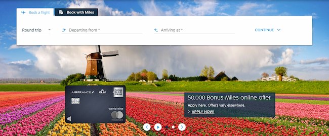
The language of this call-to-action (“50,000 Bonus Miles online offer”) is written in a way that gives visitors context even if they skim over the copy listed below it. The bottom line of text uses punctuation and uppercase letters to emphasize urgency. It’s effective because it’s both specific and action-oriented.
4. Duolingo
<img src="https://blog.hubspot.com/hs-fs/hubfs/duolingo.jpg?width=650&height=356&name=duolingo.jpg" alt="CTA copy example: Duolingo" width="650" height="356" style="height: auto;max-width: 100%;width: 650px;margin-left: …read more
Source:: HubSpot Blog


