Nostalgic Websites: What 32 Popular Sites Used to Look Like

By mvettorino@hubspot.com (Madison Zoey Vettorino)
It’s no secret that website design trends (and best practices) have changed dramatically since the internet’s debut. Reflecting on nostalgic websites and comparing them to their present-day counterparts is an excellent way to understand why updating your site is so necessary.
With the help of the Wayback Machine, we can see what our favorite websites looked like in years past. Whether you’re planning a website redesign and could use some inspiration, or you’d enjoy reflecting on nostalgic websites, we’ve rounded up 32 sites to peruse.
1) Google
While Google essentially maintains its branding with its colorful logo and whitespace on the homepage, there are other aspects of the site that look entirely different today. In the 1990s, Google had unique offerings underneath the search bar. Today, the company leans into creating a personalized homepage for users by bookmarking their frequently visited websites.
2) Apple
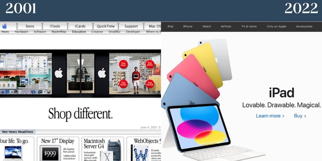
Apple always takes a product-centric approach to its homepage. Even in 2001, you’ll notice that the company’s items were the website’s primary focus. In 2022, Apple chooses to keep branding minimal yet distinctive. It features just one product to make the center focus of the homepage. The current homepage is also a testament to compelling copy; in just three adjectives, Apple paints a complete picture of why you should get an iPad.
3) Microsoft
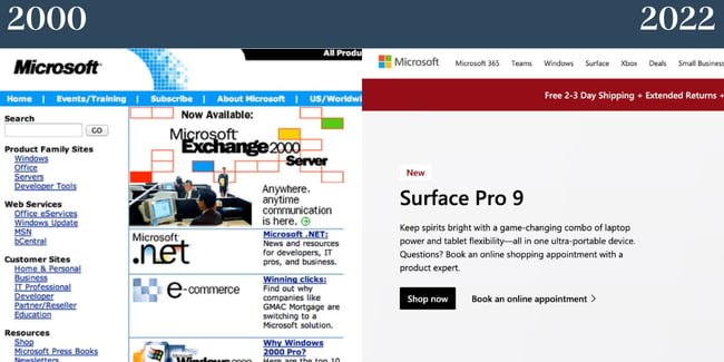
In 2000, Microsoft’s website was clunky and over-complicated. The abundance of words on the website and lack of whitespace made for an overwhelming user experience. Today, Microsoft’s site takes a cue from Apple and centers on its products. The site, as a result, is less dizzying and more digestible for visitors.
4) Mashable
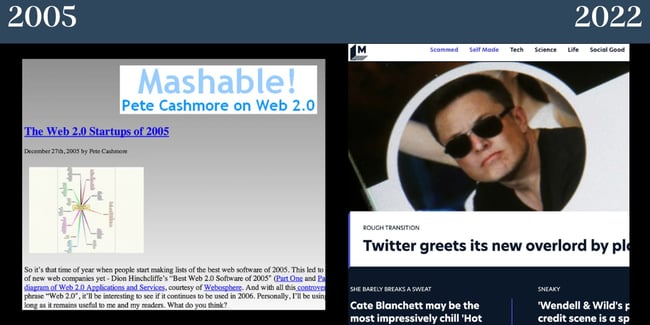
Once upon a time, Mashable had a gradient background — not to mention a serious lack of imagery. Now, the site balances visuals with text. The company branding also no longer takes center stage and focuses on featured stories.
5) HubSpot
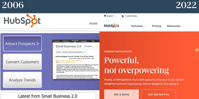
In 2006, the tech and marketing world was focused heavily on surviving and succeeding in a web 2.0 world. Small businesses were popping up worldwide, and HubSpot’s website was focused on showing how the product could add value for these companies. Today, HubSpot still caters to small businesses but also medium and enterprise corporations. Now, our website focuses more on the product …read more
Source:: HubSpot Blog


