50 Unforgettable Color Palettes to Help You Design Your Own

Choosing a color palette for your design project is an important decision that affects every aspect of your design’s performance, from visual impact to user experience.
In this post, you’ll find abundant color palette inspiration and, more importantly, learn how to choose the right palette for your unique project.
Table of Contents
- Choosing The Right Color Palette for Your Design Project
- Color Palette Categories
- 50 Color Palette Examples to Inspire Your Next Project
- Color Palette Generators
Choosing The Right Color Palette for Your Design Project
While selecting a color palette without much consideration might be tempting, you must understand that your color choices must be intentional and informed.
Colors are much more than aesthetics. Choosing colors that achieve the desired impact and communicate the intended meaning requires careful and thoughtful selection.
The question then becomes — how do you find a color palette that aligns with your design needs and preferences? A great starting point is to establish a framework for understanding and organizing these palettes through categorization.
Color Palette Categories
Understanding color palette categorization allows you to identify palettes that align with your design requirements and broadens your creative horizons beyond your habitual preferences.
While there aren’t any hard or fast rules about categorizing the near-infinite number of possible color combinations, we can approach this in two ways — creating color palettes based on the color wheel or based on inspiration. Each has unique advantages.
Note: Most palettes will belong to more than one category across both categorization methods.
Categorizing Color Palettes Based on the Color Wheel
This method categorizes color palettes based on how the colors within the palette interact with the color wheel. For context, the color wheel is a circular illustration where the position of one or more colors relative to others depicts their relationships.
Here are some color palette categories based on this method.
1. Analogous Color Palettes
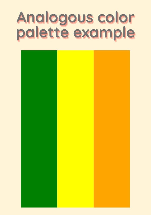
An analogous color palette, or related color scheme, is based on colors directly beside each other on the color wheel.
For example, in a basic color wheel that consists of primary and secondary colors, an analogous palette might consist of green, yellow, and orange.

These palettes are great for achieving color harmony and smooth transitions between the colors in your design.
2. Complementary Color Palettes
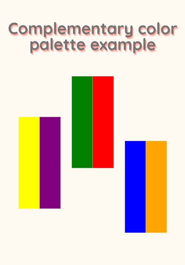
A complementary color palette, or contrasting color scheme, is based on colors opposite each other on the color wheel.
For example, in a basic color wheel that consists of primary and secondary colors, the complementary pairs would be green/red, yellow/purple, and blue/orange.

These palettes are great for achieving contrast in your designs while maintaining balance. As an additional tip, consider using your key color as the …read more
Source:: HubSpot Blog


