40 Clever 404 Error Pages From Real Websites

By rleist@hubspot.com (Rachel Leist)
Running a successful website means staying alert for errors like broken pages or slow performance. However, sometimes there are problems that you just can’t avoid, and 404 errors are one of them.
A 404 occurs when a user requests a page on your website that doesn’t exist, thus throwing a 404 error page prompting users to return to the right place. No matter how many resources you put into ensuring your website never goes down … there’s always a chance that users could end up here.
It’s inconvenient, but a fact of life. And the reaction of visitors when they land on a nonexistent page can range from “taking it in stride” to “totally losing their minds.”
While there’s nothing you can do about the latter, you can make things a little less of a pain by having a creative error 404 message. This can do wonders to make your website visitors crack a smile in an otherwise frustrating situation.
To get your website design juices flowing, this post will showcase some of our favorite website error pages. Hopefully, you’ll be able to take away a few ideas to snazz up your own 404 message.
What is a 404 Error?
A 404 error is a standard HTTP error message code that means the website you were trying to reach couldn’t be found on the server. It’s a client-side error, meaning either the webpage was removed or moved and the URL wasn’t changed accordingly, or the person just typed in the URL incorrectly.
For the most part, you can configure your server to create a customized 404 error page. (If you’re a HubSpot customer, click here to learn how to customize your 404 page in HubSpot.)
Some customized 404 error pages include a hero image, witty description, site map, search form, or basic contact information.
The Best 404 Web Page Examples
Over the years, websites have found different ways to inform visitors of a 404 error and channel them back to the right place, some simply, some creatively, and some hilariously. Let’s start by looking at some creative 404 pages, then check out some funny examples that are sure to delight anyone who comes across them.
Page Not Found: TK Creative 404 Error Pages
1. Pipcorn
While a 404 page can easily stick out from a website, Pipcorn’s error page aligns perfectly with the rest of the site’s branding. There’s a nice animated background, a friendly text prompt directing visitors to search the website (complete with a clever pun), and a piece of popcorn used as the “0” in “404.”
2. Spotify
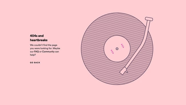
Music streaming giant Spotify has covered its bases with a clever 404 page. With a witty pun off Kanye West’s album “808s and Heartbreak” and a record animation, the website briefly entertains and then sends visitors back to the page they came from.

3. …read more
Source:: HubSpot Blog


