20 of the Best Product Page Design Examples We've Ever Seen

By lkolowich@hubspot.com (Lindsay Kolowich Cox)
If you compare how product pages take shape across different companies, it’s clear they run the gamut. Some go for the direct approach, displaying an image of a product and explaining why someone should buy it. Other companies create elaborate pages with moving parts and fancy, interactive elements.
Still, other companies create delightful product pages that give users an authentic experience as they browse through what the company has to offer.
Believe it or not, the most captivating product pages don’t always have enterprise-level programming behind them. To give you an idea of what’s possible — from small business all the way up to household names — we scouted out 20 examples that we find truly admirable.
The pages below have mastered their messaging, value propositions, and general product descriptions such that these sites resonate with their unique buyer persona.
(And after checking out these pages, you might want to buy their products, too.)
20 of the Best Product Landing Page Designs
1. Bellroy
Bellroy sells thinner-than-typical wallets. There’s value to that — but what is it, and how do you get the consumer to understand it?
To answer those questions, Bellroy divided its product page into three stages of the buyer’s journey — understanding the problem, how to fix the problem, and how Bellroy can resolve the problem.
There’s even an interactive section that shows how the skinny wallet will fill up in comparison to standard wallets. As users move a slider back and forth along a line, both of the wallets fill up with cards and cash, visually displaying the very problem Bellroy’s skinny wallet solves.
2. Wistia
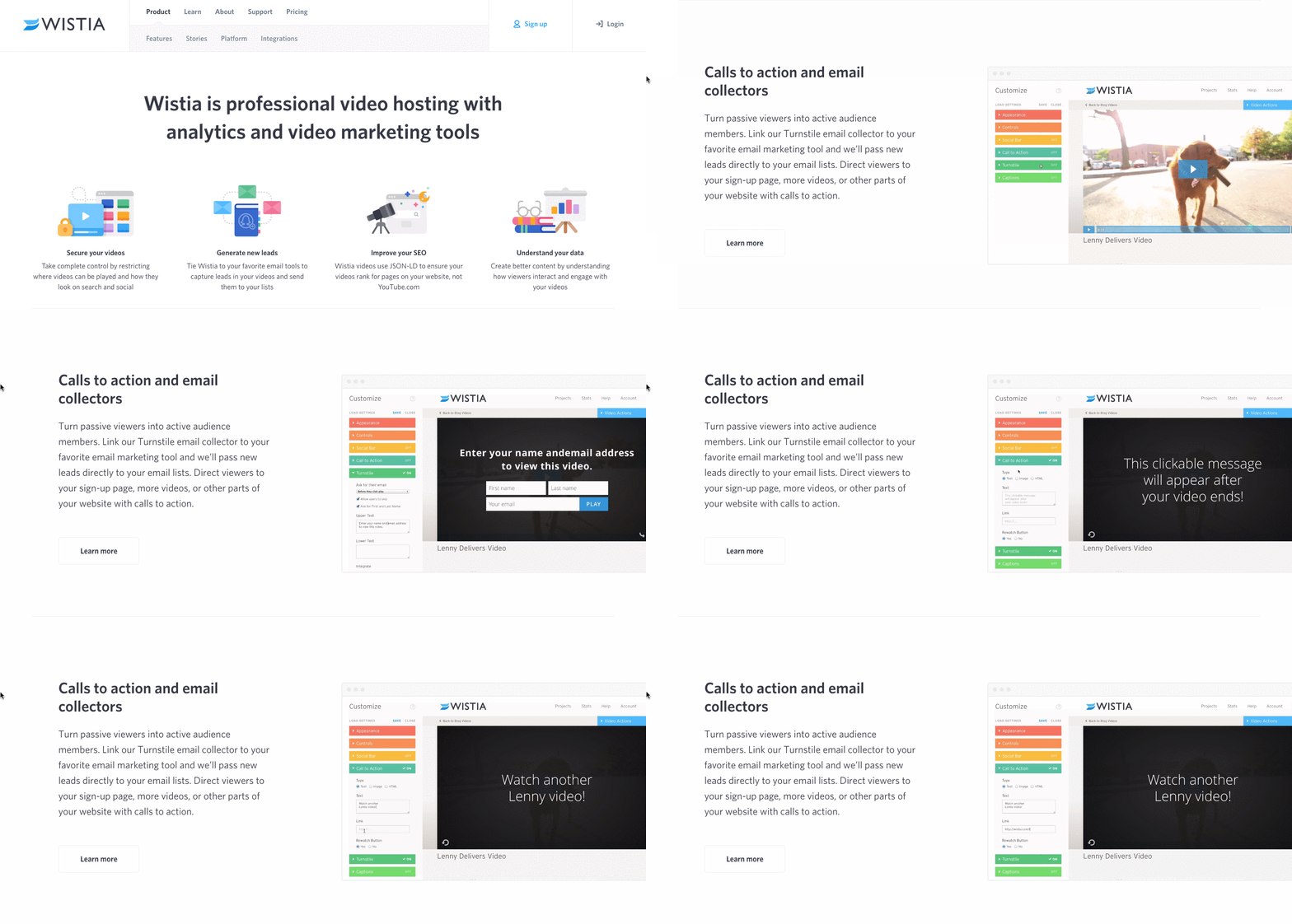
Wistia is a video hosting and analytics company that provides users with detailed video performance metrics. It might sound like a snooze-fest, but let’s dive into what really makes this product page stand out.
First, we’re presented with five, colorful graphics illustrating the tools’ value propositions. And in case that’s all the user really needed to see, those graphics are followed by two calls-to-action.
But, if you continue scrolling, you’ll see a video with information about Wistia’s capabilities for that video — calls-to-action, email collectors, video heatmaps, and viewing trends.
One of the best ways to explain a visual platform’s features is to demonstrate them on a product page. This one shows users all of Wistia’s features and how they work, day-to-day.
3. Square
Square is a mobile transaction company that merchants use to collect payment from customers — anywhere, any time, as long as they have a compatible phone or tablet.
The product marketing challenge here is to show why Square is an easier alternative than a typical cash register — and its product page displays those reasons in a visually captivating way.
The rest of the page is …read more
Source:: HubSpot Blog


