19 A/B Tests You Should Run on Your Website

By Neil Patel
Conversion rate optimization isn’t an easy game to play, especially if you’re the new kid on the block. One of the best ways to improve CRO is by A/B testing features on your website.
The real challenge with CRO is in knowing how to start and what to test. This post covers the latter.
There is one thing to keep in mind: testing every random aspect of your website can be counter-productive. You can blow time and money on software, workers, and consultants, testing things that won’t increase your website revenue enough to justify the tests.
So before you dive in, make sure to think about what your goals are.
Then, take a look at the following tests and see which ones make sense for your specific business. If so, ahead and run it. If not, try another one.
A/B Test: Typography
Typography is proven to affect conversions in a major way, but casually testing each Google font won’t get you anywhere. There are a few aspects of typography you need to test first before getting specific with typefaces.
1. Serif vs. Sans Serif
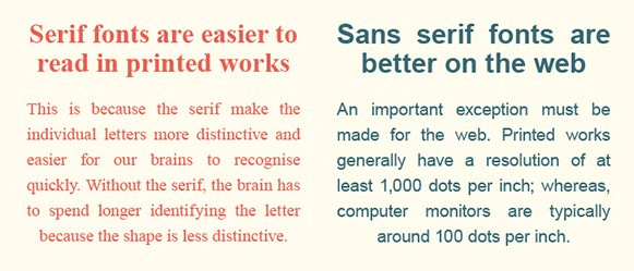
Serif typefaces are accented with various widths for each line in a character and contain flourishes (for example, Times New Roman). Sans serif typefaces are just the opposite, plain with a consistent width (like Arial).
I suggest using sans serif, but interestingly, Georgia (a serif typeface) is by far the most popular typeface on the web.
Try both varieties to see which works best for your website.

As per a WDD infographic, sans serifs are best for the web, and serifs for print.
2. Colors
For your blog, your long-form copy, and most of the text on your website, always go with black (dark) text on a white (light) background. It’s a traditional color scheme our eyes are accustomed to.
For your calls to action and other smaller, more impactful text elements, however, test each of the basic eight colors (or whatever colors fit with your design). Always remember this principle: what stands out gets clicked.
3. Font Size
Tahoma tends to be the most legible at 10 px, Verdana and Courier at 12, and Arial at 14 px.
Whatever typeface you choose, make sure that you test the differences in user engagement and click-throughs according to the size of the font. These days, as mobile traffic increases, larger tends to work better — but not always.
4. Typefaces
Finally, we get to the most tedious typography test – typefaces. Take this one with a grain of salt. Don’t test each of the 700+ Google fonts available. Doing so would be very counter-productive. Only test a few of the major ones that harmonize with your design.
When testing these, you’ll also want to go with an A/B/C/D/etc. test. This will let you test multiple typefaces at a time.
A/B Test: Calls to Action
Your call to action (CTA) is the most influential element on …read more
Source:: Kiss Metrics Blog


