16 Cheerful Examples of Holiday Homepage Designs

By lkolowich@hubspot.com (Lindsay Kolowich Cox)
According to the National Retail Federation, eCommerce accounted for 20.9% of total holiday sales in 2019, and that number seems to increase every year. As a result, you have the opportunity to position your online shop in front of a huge base of consumers who are actively browsing the web with intent to purchase goods.
The smartest marketers prepare for website traffic increases not only by prepping their website for higher-than-normal traffic and optimizing it for mobile devices, but also by giving their website design a dose of holiday cheer.
It all starts with the homepage: The first page many people will see when they come to your website.
Holiday Homepage Designs to Get You in the Spirit
How have other companies redesigned their homepages for the holidays? Let’s take a look.
Note: Businesses change their homepages on a regular basis. The examples below may not be current.
1. Free People
When your business has a loud personality like American bohemian retail company Free People does, making a big first impression on your homepage can be a great thing. Free People’s redesign is all-encompassing, starting with a large banner promising free express shipping, which appeals to any buyers concerned about delivery times when doing their last-minute shopping.
Underneath the main banner are four navigational calls-to-action emphasizing gifts and festive products. This directs holiday shoppers to the pages of their site they’ll find most useful.
2. PayPal
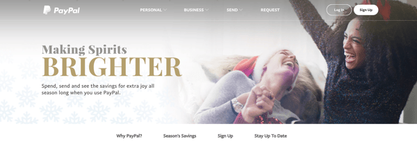
Who ever said online money transfer websites can’t have fun at the holidays? After all, sometimes the best gift is a little more padding in your bank account, and PayPal acknowledges this with the slogan: “Making Spirits Brighter: Spend, send and see the savings for extra joy all season long when you use PayPal.”
This holiday design from PayPal works because it still looks like PayPal — just a little more festive. It’s still easy to navigate but adds seasonal flair with a clever spin on a lyric from “Jingle Bells” as its holiday slogan. The whitespace encourages visitors to focus on the happy models in the image, putting human faces to an industry that’s businesslike and technical.

3. Sephora
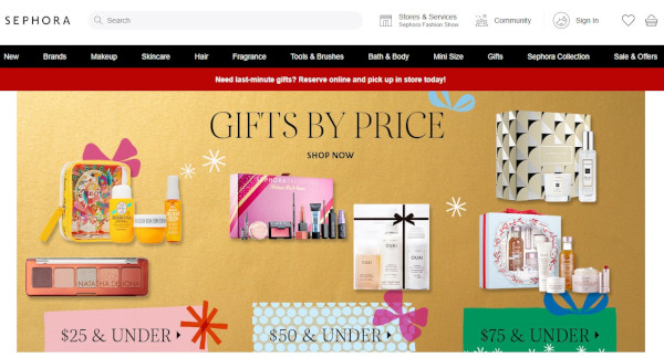
Like PayPal, Sephora didn’t make many changes to the overall look and feel of its website. What it did do was feature a holiday edition of its highest-rated products and editors’ picks, specially curated for different gift recipients, price ranges, categories, and so on.
By putting editors’ picks front and center, Sephora is reminding customers how much the company values customers’ success. Plus, we love the gold background color — it’s a cute, festive way to make the homepage cheery and bright.

4. Baudville
While seasonal website redesign is often dominated by B2C companies, a few B2B businesses have been known to dress …read more
Source:: HubSpot Blog


