10 Types of CTAs You Need to Have on Your Website

By gsoskey@hubspot.com (Ginny Mineo)
There’s no one-size-fits-all solution for calls-to-action (CTAs), especially when you have multiple audiences perusing your website at any given time.
Visitors, leads, customers, and promoters are likely to visit your site, so you’ll need several types of CTAs to get them to accomplish different goals.
To help you turn visitors into leads, leads to customers, and customers to promoters, I’ve put together a list of CTAs to use for each audience. But before we get into that, let’s discuss what a CTA is.
Without a CTA, potential leads and customers may struggle to find the correct path to buy a product or sign up for a service or list. CTAs help companies generate leads, but they also help delight customers and avoid frustration.
Now you know what a CTA is, here’s a list of CTAs that will benefit your website.
10 Types of CTAs Marketers Should Know
The CTAs below can be made with our free PowerPoint Template, so download it here if you want to use them on your own website. You can also create a CTA with HubSpot’s CTA tool.
1. Lead Generation
As mentioned earlier, calls-to-action are crucial to generating leads from your website. Since you’re trying to turn visitors into leads via these CTAs, you’ll want to place them in any spot on your website with a high percentage of new visitors.
The best place for a lead generation CTAs is on blog. Specifically, you should add a CTA at the end of the blog post, in the sidebar, and as a floating banner in the corner.
Successful CTAs are eye-catching and effectively communicate the value of clicking on it. In other words, visitors should know exactly what to expect when they get to the landing page the CTA points to.
Below is an example of a lead generation CTA:
2. Form Submission
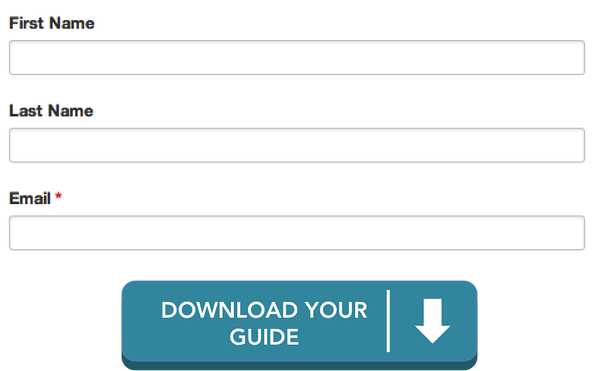
Let’s say your visitor get to your landing page — there are still two more things they need to do to register as a lead. Your visitor still need to fill out a form and click on a button to submit their information to your contacts database.
At this stage, your visitor is close to becoming a lead, so you don’t want them to slip through the cracks with a lackluster submit button.
Instead, trade out your “submit” button copy for something more actionable and specific to the marketing offer they are about exchange information for.
The lead capture form and button below are much more actionable and engaging than a simple “submit” button. If you’re interested in crafting a form for your site, HubSpot has a free online form builder here.
3. “Read More” Button
Whether you place a feed of content in your blog, customer case study page, or …read more
Source:: HubSpot Blog


