21 of the Best Examples of Mobile Website Design
By rleist@hubspot.com (Rachel Leist)
Now more than ever, businesses are focusing on creating delightful mobile website experiences.
Google has been heavily favoring mobile-friendly websites since 2015 when it updated its ranking algorithm, then started indexing mobile sites in March 2018, and has conducted mobile-first indexing since 2019. This is crucial, as there have been more search queries on mobile devices than on desktop for several years now.
Going forward, Google will only continue to raise the bar for what it considers to be mobile-friendly (
To help inspire any mobile website design changes you’ll be making, here’s a list of 21 companies who really nailed their mobile web experience.
1. Shutterfly
Why it works: Shutterfly’s mobile website is easily navigable, highly visual, and intuitive for new visitors and experienced customers.
Shutterfly is an online service that allows users to create photo books, personalized cards, stationery, and other similar products. Because more and more people are taking photos and then accessing them using their smartphones, Shutterfly recognized the need to create a great mobile experience for their customers.
Shutterfly accomplishes two key goals on their mobile website. First, it’s easy for users to find out information about their offerings. Second, this information is complemented by beautiful imagery.
When you arrive on the mobile site, you’ll see Shutterfly’s latest promotion front and center as well as a finger-sized top navigation menu, neither of which overpower the user experience.
Scroll down and you’ll see large buttons that make it easy for users to quickly select which type of product they’re interested in. Once users click through to one of those options, they’re greeted with large photos showcasing what Shutterfly is capable of for easy browsing.

2. Google Maps
Why it works: The mobile website for Google Maps brings the same functionality, visuals, and performance as its mobile app counterpart.
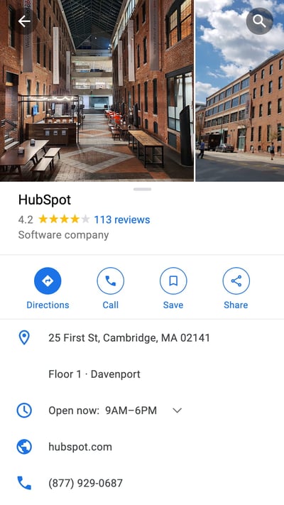
Everyone has their favorite map or directions application. Mine is Google Maps, which I use whether I’m walking, driving, biking, or taking public transportation. What’s special about its mobile website is that it’s virtually indistinguishable from their downloadable mobile app.
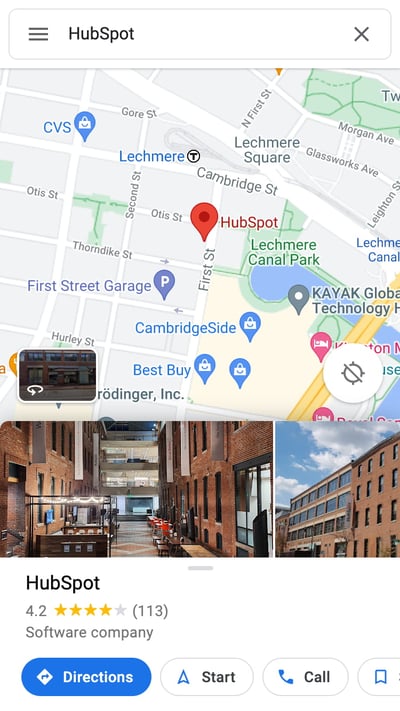
These screenshots below are taken of their mobile website, but if you’re familiar at all with the app, you’ll notice they look exactly the same. Not only is the appearance identical, but the mobile website has the speed and functionality of the app.
3. Typeform
Why it works: Type form simplifies their mobile website to improve load times and deliver a simpler user experience.
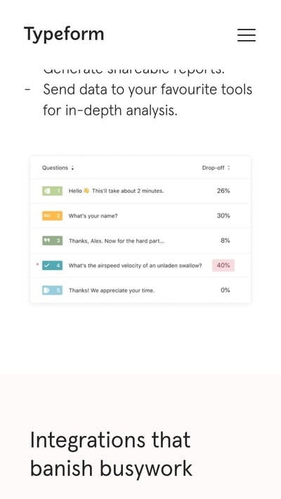
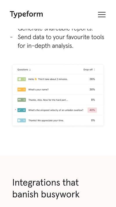
Typeform is a Barcelona-based tech company with one simple mission: to “make forms awesome.” Their desktop website is beautifully designed, greeting visitors with succinct copy, relevant animations, and other complex design components.
But for mobile users, Typeform recognized that this …read more
Source:: HubSpot Blog

